Note: In these series I will share some of the shapefiles that I have created myself. A lot of work has gone into creating these shapefiles, so if you do use them, please be sure to give me a wee mention.
Getting Started
Download shapefiles and data below (dropbox links)
plu_1911.shp
data_1911.csv

Download and install R and RStudio on your pc/mac
Links will bring you to external site (ignore step if you have these already)

Download R
Download RStudio
Presenting your own high quality maps is a great tool for quantitative researchers. Not only does it mean that you can look for interesting spatial relationships, but they also allow you to dazzle (and maybe distract) your audience.
R is flexible enough to create static maps, interactive maps, and even gifs to show how some spatial relationships change throughout time.
This series is intended to get you started with making some basic maps. This post covers the packages that I recomend, I’ll provide shapefiles and data, and some code to walk you through the process.
Step 1) Install packages, load data, and join to shapefile
#Install relevant Packages
install.packages(tidyverse)
install.packages(sf)
install.packages(tmap)
install.packages(data.table)

#Load Packages
library(tidyverse) ; library(sf) ; library(tmap) ; library(data.table)

#Load Data
rm(list = ls())     #clear environment (skip if you dont want to do this)
setwd("C:/Users/YOUR FILE PATH HERE")   #set working directory
data <- fread("data_1911.csv")           #load population data
plu  <- read_sf("plu_1911.shp")          #load shapefile

#Join Data and clean up
plu <- left_join(plu, data, by = "plu1911")
rm(data)
After following this code you should be left with a single object in your environment called “plu” that is a shapefile and contains all the data from the csv file that you imported. Some tips!
- Your working directory can just be a folder that contains the downloaded shapefile and data. When we finally export our maps they will be saved to this location.
- Careful if you are copy and pasting this folder path from the windows explorer address bar. Windows always uses a backward slash \, but R will lose its mind if it sees them in the setwd() command. Make sure your filepath uses forward slashes / throughout (just change them manually). If you are doing this on a mac, sorry- you’re on your own. I have no idea how a mac works.
- In left_join() it is not always necessary to specify the variable you want to to link to. R will look for a common variable(s) in both objects to match. If you have duplicate variable names, this command will not work.
- In left_join() always specify your shapefile first. Otherwise your new object will be of the same type as your data (probably some form of data frame), and that will not work for mapping.
Step 2) Calculate a variable to visualise and create a basic map
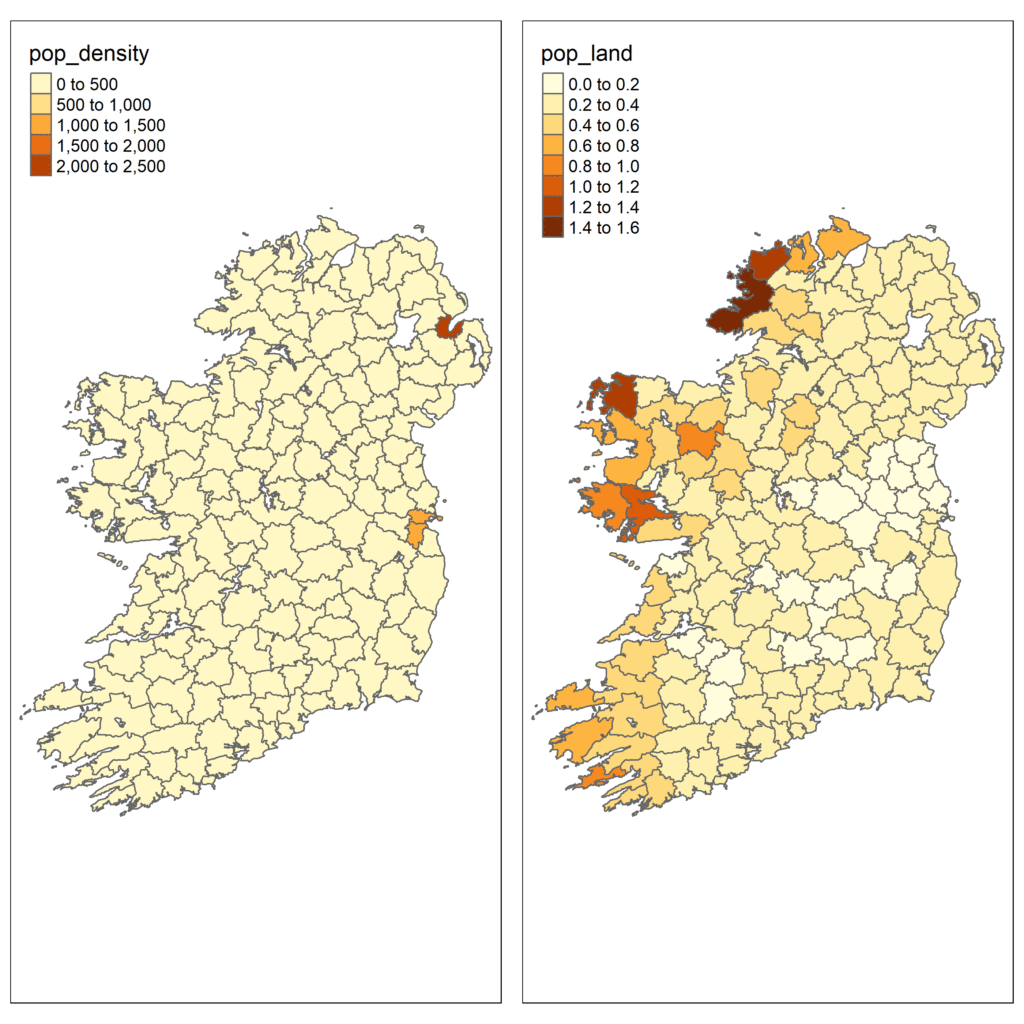
Now that you have all your data imported and linked it to the shapefile, you can now generate a variable to create your first map. The data that you linked to the shapefile contains Union area(km2), land valuations, and total population. To assist with visualisation, we can create a measure of population density and land valuations per capita.
#Generate population variables
plu <- plu %>%
        mutate(pop_density = pop11 / area_km2,
               pop_land    = pop11 / val_1911)

#Create basic maps and store as new objects
map1 <- tm_shape(plu) +                     #call up the shapefile
        tm_polygons("pop_density")          #select variable to map
map2 <- tm_shape(plu) +
        tm_polygons("pop_land")

#Display maps in R viewer
map1
map2
Since we have a shapefile, the data is joined to polygons that describe the geographical extent of each Union. That is why we use the function tm_polygons() to ensure that each polygon is shaded according to the value of the variables pop_density or pop_land.
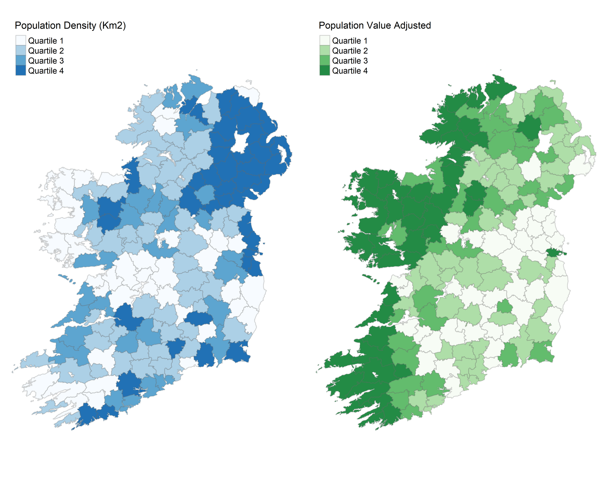
Step 3) Improve presentation
Although we have created a solid map, it looks awful and is completely inappropriate for publication. Thankfully, the tmaps package is really flexible and can visualise some really lovely maps.
#Edit the first map
map1 <- tm_shape(plu) +
  tm_polygons("pop_density",
              breaks = c(-Inf, 30, 40, 50, Inf),
              palette = "Blues",
              title = "Population Density (Km2)",
              labels = c("Quartile 1", "Quartile 2", "Quartile 3", "Quartile 4"),
              border.alpha = 0.3) +
  tm_layout(frame = FALSE)

#Edit the second map
map2 <- tm_shape(plu) +
  tm_polygons("pop_land",
              breaks = c(-Inf, 0.22, 0.28, 0.37, Inf),
              palette = "Greens",
              title = "Population Value Adjusted",
              labels = c("Quartile 1", "Quartile 2", "Quartile 3", "Quartile 4"),
              border.alpha = 0.3) +
  tm_layout(frame = FALSE)

#Take a look in the R viewer
map1
map2
Some handy definitions here:
- breaks defines the value where one colour changes to another. Unless specified, R will automatically calculate the breaks to use. Here I’ve simply calculated quartile breaks and coded these manually.
- palette sets the colour scheme for the maps. Here we have used one of the pre-packages schemes (you can find a list of these here). The colour presets are pretty handy, but if you want a little more control over things I recomend using hex codes. You can simply look up a list ownline or ask your preferred AI assistant to suggest a few. For example, if I wanted these quantile breaks to transition from a dark red to a light red I would code palette = c(“#8B0000” , “#B22222” , “#CD5C5C” , “#F08080”) .
- title renames the title of the map legend. Notice that I did not set a main chart title using main.title(). This is pointless, it takes up room in the plot and you can manually add one later in your paper Figure 1: etc. etc.
- labels renames the map legend entries
- border.alpha() changes the transparency of the polygon borders. It takes any value between 0 and 1, so a value of 0.3 means they are relatively invisable. This improves the professional look of the map.
- tm_layout() allows for some additional options. Here I remove the frame around the map, I simply do not like it.
Step 4) Export maps
Now we are on the home straight! All we have to do now is export the maps. There are two options here- either we can export both maps separately, or we can arrange them side by side and export as a single image.
#Export maps separately
tmap_save(map1,                              #name of the stored map
          filename = "map_pop_density.png",  #name it whatever you want
          dpi = 500)                         #Dots Per Inch
tmap_save(map2,
          filename = "map_pop_value.png",
          dpi = 500)

#Export maps side by side
maps <- tmap_arrange(map1, map2)
tmap_save(maps,
          filename = "both_maps.png",
          dpi = 500,
          height = 7,                        # amend height and width
          width = 8.5)
Some things to remember
- You can set DPI higher or lower- higher values will improve image quality but increase the size of the image.
- For the joint map, you may have to configure the height and width, especially if you have longer map legends
That’s all there really is to it, happy mapping!
Leave a Reply